Geico's Payment Form: Indentation Matters
While paying my car insurance on Geico’s website this morning, I was faced with the same payment form that bothers me every month. Actually, it’s only one section of the form: the saved account section:
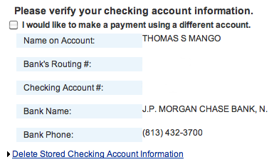
Every time I come to this form, I instinctively check the box above my saved bank account information. However, if you read the label attached the checkbox you’ll see that the checkbox actually lets you use a different account.
The fact that the checkbox is above your saved account details and your saved account details are indented, leads you to believe that the checkbox is tied to that account.
I mentioned this on Twitter and, within an hour, @geico_service replied and said they’d tell the website team. I have no idea if they’ll fix it or not, but I figured that was my chance. I edited the html of the form quickly and sent them a mockup of what I always expect to see in that area:
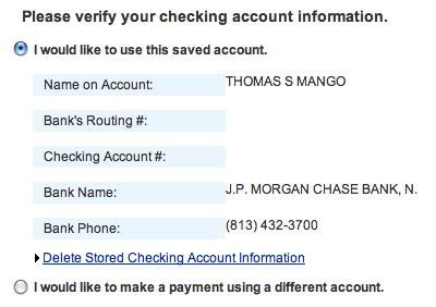
It’s a really minor change, but I think it helps a lot. The original form had the intention of allowing you to continue without doing anything. Your account information is saved so if you want to use it, don’t click anything. I think my mockup here drives that point home more.
You have two options, the default is to use your saved account (notice the radio button is above the indented account details) and the second option, that isn’t selected by default, is below the saved account details and allows you to use a different account.
Little things like this can go a long way when designing a form in your web application.